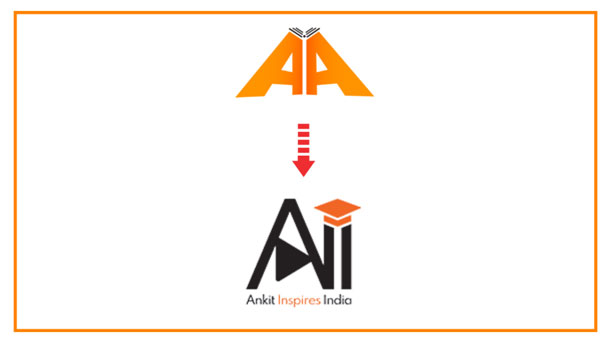
As we all know that the logo of any company and organization helps everyone to understand it well, we initiated a logo change. The color and font used in it clearly tells our dedication towards our learners. The neat & clean design of the logo identifies its simplicity and high values about our vision.
Each color in the universe represents some uniqueness and psychology. Let’s have a look at the psychology behind the colors we chose for our brand identity.
The Color Code: #F06625 Orange Color:
Orange colour comprises the energy of red and the happiness of yellow color. It is connected with joy, sunshine, and the tropics. Other than this, orange represents enthusiasm, fascination, happiness, creativity, determination, attraction, success, encouragement, and stimulation which students connect definitely.
The Color Code: #231F20 Black Color:
The black colour adds the water element and evokes power, mystery, and calm. These elements should be adopted by each and every learner. When it’s used sparingly, black has a grounding effect on the environment around us.
New Logo Elements - Ankit Inspires India:
- Play Button in ‘A’ Character: Play button represents our presence on the world’s largest video website i.e. YouTube. Click here to visit our YouTube Channel. Don’t forget to subscribe to it for amazing stuff.
- Educational Cap in Last Letters: Cap is used to inspire the audience so that they may look forward to achieving their dreams. Ankit Inspires India is always with such students as this is not only their dreams but ours too.
Hope you like the changes made in the logo. Thanks for scrolling down.


1 comment